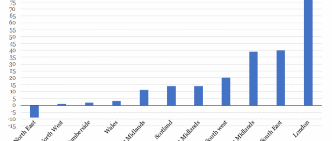
This chart shows that London house price growth over the last decade has far outstripped all other regions in the UK, with areas of staggering growth such as Hackney, which rose 120%.
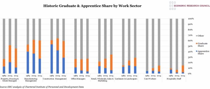
Chart of the Week: Week 31, 2017: Historic Graduate and Apprentice Share by Work Sector
This chart shows the increasing graduate share and declining apprenticeship share in the workforce within selected work sectors since the late 1980s.
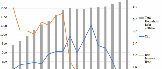
Chart of the Week: Week 30, 2017: Household Debt v.s. Interest Rates and CPI
The base rate climbed steadily to 5.5% in 2008 before the global financial crash, after which it plummeted to 1.5% within one year as the Bank attempted to stimulate investment and consumption.

August 2017
I have outlined many confusing issues, the world economy in general is chugging along nicely in spite of everything. People and businesses are getting on with running their affairs and the steady, albeit slow, growth…
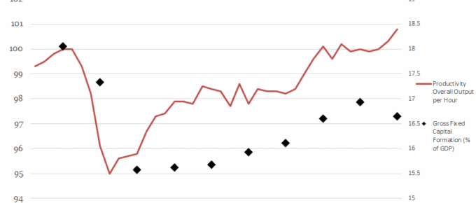
Chart of the Week: Week 26, 2017: Productivity Output v.s. Gross Fixed Capital Formation
This chart shows the relationship between the level of gross fixed capital formation (GFCF) and the productivity of the economy.
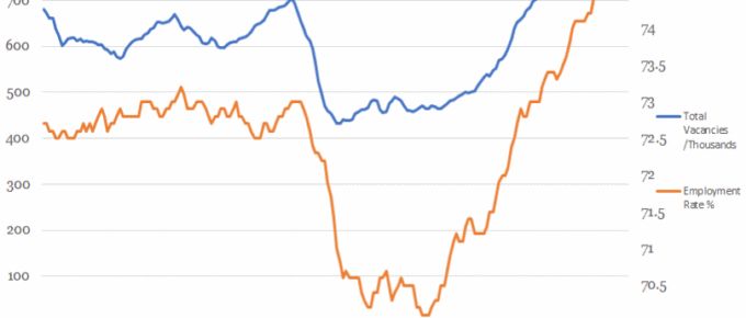
Chart of the Week: Week 25, 2017: Vacancies v.s. Employment Rate
This chart shows that the overall employment rate has been tracked by the number of available jobs until the financial crash.