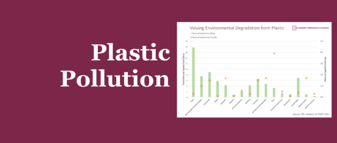
This week’s chart takes a slightly different angle, assessing the value of environmental degradation from plastic use in various sectors.
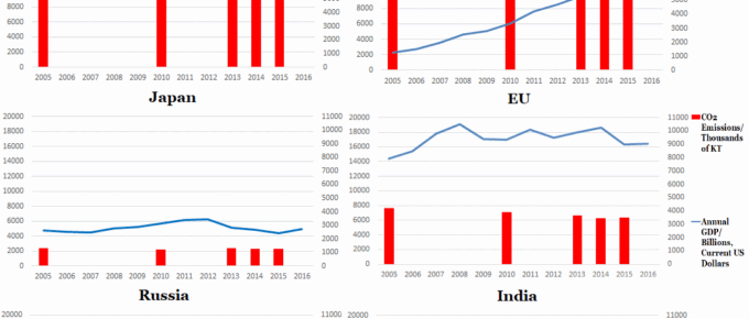
Chart of the Week: Week 29, 2017: Top 6 Polluters’ Emissions v.s. GDP
The set of graphs generally indicates that developed countries are beginning to reduce their emissions, whereas India and China are seeing their emissions rise, as they undertake vast infrastructure projects and continue to lift sizeable populations out of poverty.