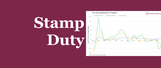
This week’s chart assesses the effect that the holiday had on the housing market, as well as the wider economy.
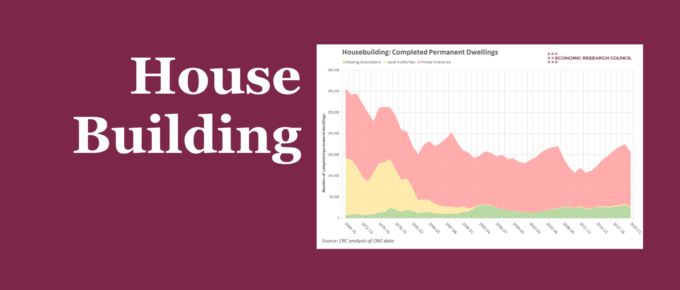
Chart of the Week
This week’s chart assesses how the supply of housing has changed over time, and the extent to which we can learn from the factors that have caused these changes.

Chart of the Week
The extent to which can affordably rent varies considerably across the country, with London, naturally, being least affordable. We show that this isn’t just an issue for those on lower incomes.

Chart of the Week
According to the Bank of England, the availability of mortgages declined dramatically in the three months ending May 2020 – implying a bigger credit squeeze than in the worst three-month period of the global financial crisis.
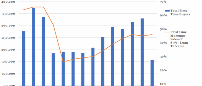
First Time Buyers vs First Time Mortgage Sales of 85%+ Loan To Value
The chart demonstrates that especially among first time buyers, homeownership is still struggling in the wake of the recession, far from its 1980s peak. However, ….
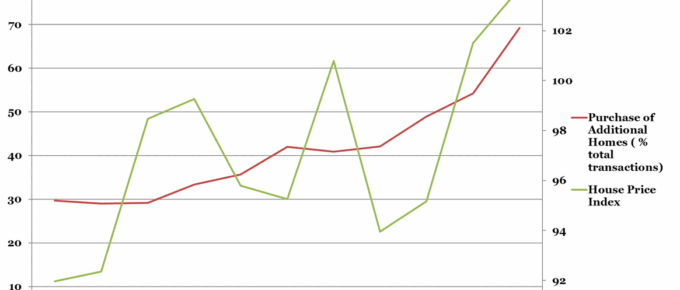
Chart of the Week: Historical Chinese Residential Property Market Trends
It would be unremarkable were house prices increasing as a function of total home purchases,
however, this graph shows that the key driver of HPI rises is not the fundamental demand for
housing. Rather it is in response to…