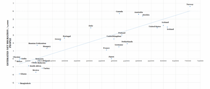
This chart plots 31 countries according to the level of GDP and net migration relative to their populations.
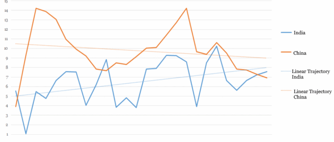
Chart of the Week: Week 2, 2017: China and India Historical GDP Growth
The chart shows that China and India, the world’s two most populous nations, have enjoyed dramatic positive growth over the past 25 years.
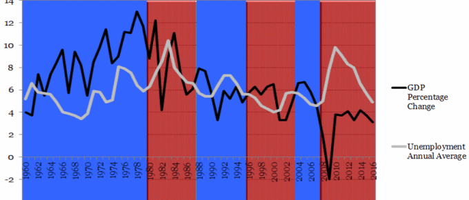
Chart of the Week: Week 45, 2016: US GDP and Unemployment
The chart shows that with the exception of 2 occasions, each time the incumbent was ousted at general election, GDP had fallen in the year prior.
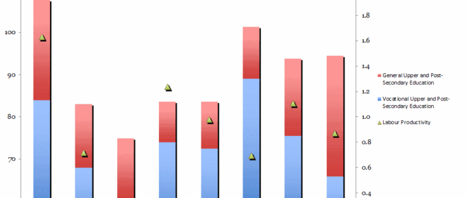
Chart of the Week: Week 44, 2016: Government Spending on Education v.s. Labour Productivity
The chart shows that the UK, when compared to other EU countries with strong economies, has one of the lowest levels of spending on vocational education as a percentage of GDP (under 1.5%).
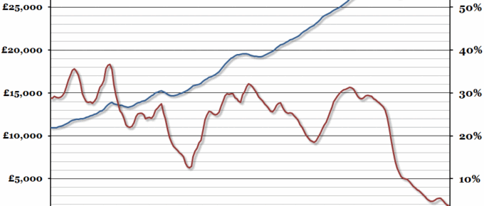
Chart of the Week: Week 30, 2016: UK GDP Per Capita
The preliminary estimate for GDP growth in the second quarter of 2016 was 0.6%, slightly higher than in the first quarter of the year.
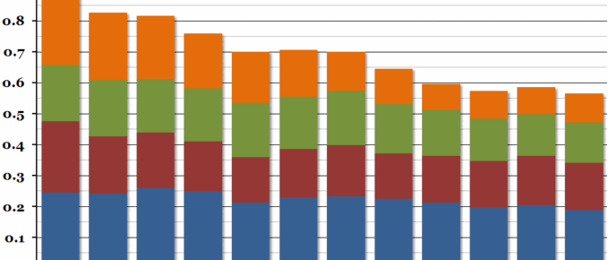
Chart of the Week: Week 29, 2016: Science, Engineering and Technology Spending
The Office for National Statistics released their annual report on government spending on science this week, and although in nominal terms spending has increased by more than £2 billion since 2003, it has fallen significantly as a proportion of GDP.