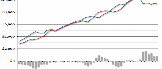
With the annual UK Budget due this afternoon, we’ve updated our yearly chart showing the central government finances per person.
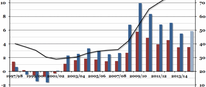
Chart of the Week: Week 48, 2014: UK Public Sector Finances
Government finance figures were released at the end of last week, and they suggested that the government deficit in 2014/15 may end up higher than it was during 2013/14 – and the sixth highest in the last twenty years.
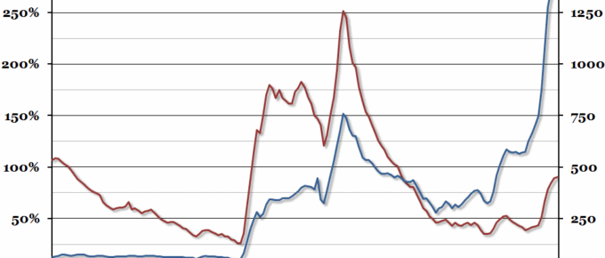
Chart of the Week: Week 17, 2014: Historical UK Government Debt
The latest public sector finances were released this morning, so we decided to update our chart from this time last year showing historical UK government debt going back to 1855 (this time in 2013 prices).
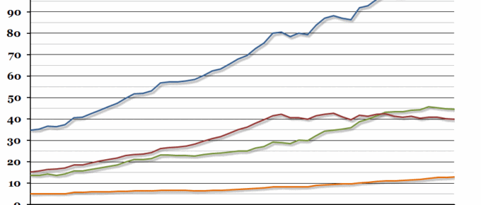
Chart of the Week: Week 11, 2014: Global Debt
This week, the Bank of International Settlements published their Quarterly Review, which included an interesting chart showing the estimated level of outstanding global debt.
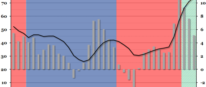
Chart of the Week: Week 48, 2013: Public Sector Finances
Public sector finance figures were released at the end of last week, showing that net borrowing had decreased in the financial year 2012/13.
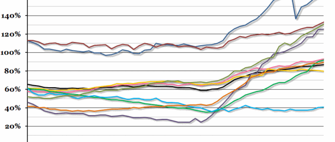
Chart of the Week: Week 43, 2013: European Debt-to-GDP Ratios
Now that the US debt crisis is over (until next time a deadline looms), we can turn our attention back to Europe.