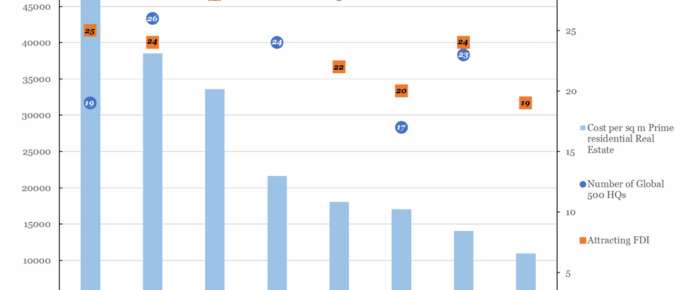
The chart shows that there is little to no correlation between the number of Global 500 companies headquartered in a city and the cost of prime real estate.
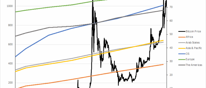
Chart of the Week: Week 7, 2016: Bitcoin Price v.s. Internet Users by Region
The chart shows that Bitcoin is a niche market which bears no correlation to the number or distribution of individuals across the globe who have internet access.
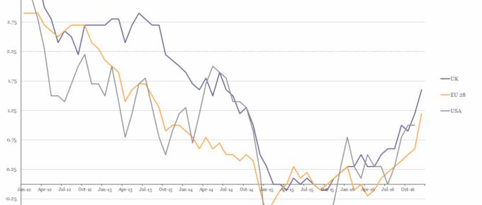
Chart of the Week: Week 6, 2017: USA, EU28 and UK Inflation
The chart shows that in 2016 the HICP rate of inflation for all three parties rose above 1% for the first time in over 2 years.
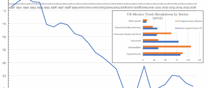
Chart of the Week: Week 5, 2017: US Trade with Mexico
The chart shows that the US has been in trade deficit with Mexico since Clinton came to power, with George Bush Jnr presiding over the period with the largest deficit increase; around $29 billion.
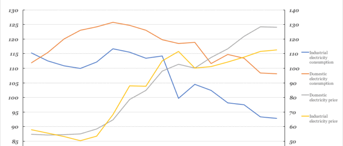
Chart of the Week: Week 4, 2017: Historical Electricity Prices vs Consumption
In this chart we can see that from 2000, consumption by both industry and the public has declined. The price of electricity supplied to both domestic and industrial sectors has risen significantly.

Chart of the Week: Week 3, 2017: US Presidents’ Relative Economic Performance
In this inauguration week, the ERC is looking back at the last six US presidents and the state of US economics during their terms.