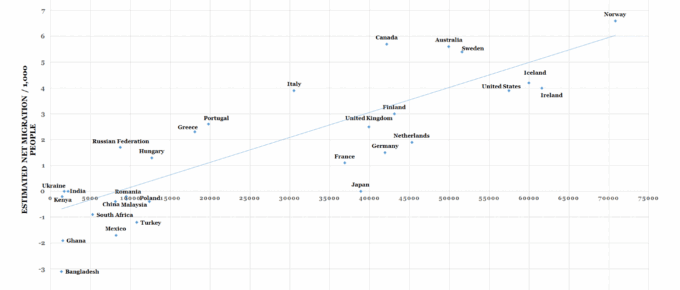
This chart plots 31 countries according to the level of GDP and net migration relative to their populations.
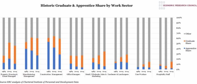
Chart of the Week: Week 31, 2017: Historic Graduate and Apprentice Share by Work Sector
This chart shows the increasing graduate share and declining apprenticeship share in the workforce within selected work sectors since the late 1980s.
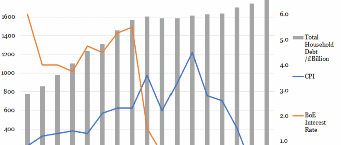
Chart of the Week: Week 30, 2017: Household Debt v.s. Interest Rates and CPI
The base rate climbed steadily to 5.5% in 2008 before the global financial crash, after which it plummeted to 1.5% within one year as the Bank attempted to stimulate investment and consumption.
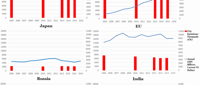
Chart of the Week: Week 29, 2017: Top 6 Polluters’ Emissions v.s. GDP
The set of graphs generally indicates that developed countries are beginning to reduce their emissions, whereas India and China are seeing their emissions rise, as they undertake vast infrastructure projects and continue to lift sizeable populations out of poverty.
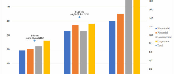
Chart of the Week: Week 28, 2017: Changes in Composition of Global Debt
This chart shows a positive trend in the growth of global debt, growing from $87 trillion in year 2000 to $199 trillion in 2014.
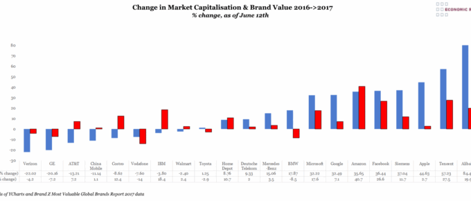
Chart of the Week: Week 27, 2017: Change in Market Capitalisation and Brand Value
This chart shows the performance of a number of brands detailing the changes in both their stock market capitalisation and brand value over the past year.