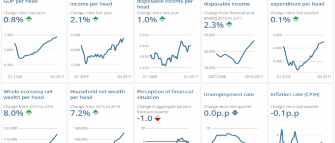
The charts show key changes in the UK economy… click to find out more!
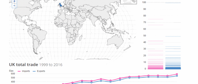
Chart of the Week: March 2018: Explore UK Trade with the World
The map charts the UK trade balance with almost all nations of the world, simply click a country to display!
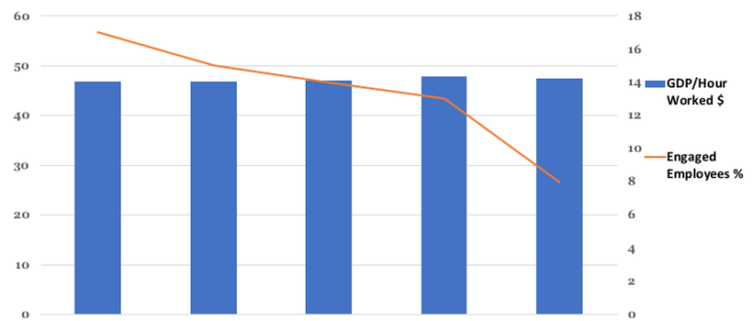
Chart of the Week: Week 4, 2018: GDP per Hour Worked v.s. Employee Engagement
The chart shows that just 8% of UK employees are enthused about their work and work environment in 2016. This represents a fall from 17% in 2012. The chart …
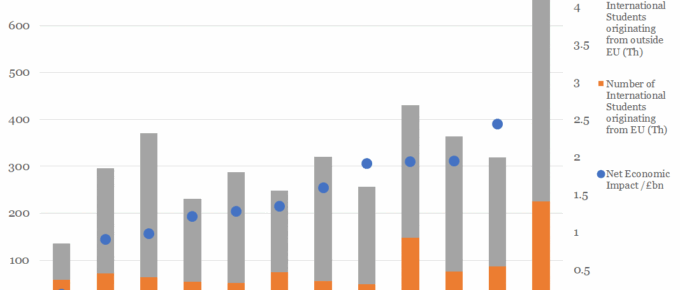
Chart of the Week: Week 2, 2018: International Students’ Economic Impact by Region
The chart shows the economic impact of the 2015/16 cohort of international students, who on average, contribute £1.7bn to each region displayed. Of the international students in this cohort, an average of 25% originate…
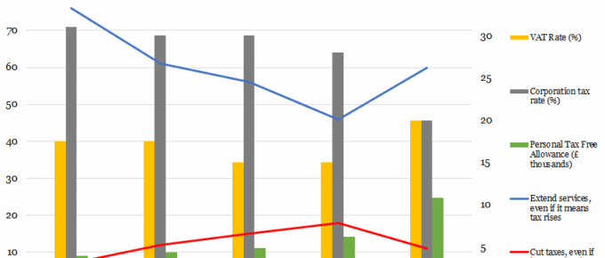
Chart of the Week: Week 34, 2017: Historical Support for Tax Rises v.s. Corporation tax, VAT and Personal Allowance
The chart shows that support for the raising of taxes to extend public services had been waning steadily between 1997 and 2009.
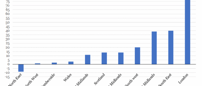
Chart of the Week: Week 33, 2017: UK Houseprice Growth since the Financial Crash
This chart shows that London house price growth over the last decade has far outstripped all other regions in the UK, with areas of staggering growth such as Hackney, which rose 120%.

